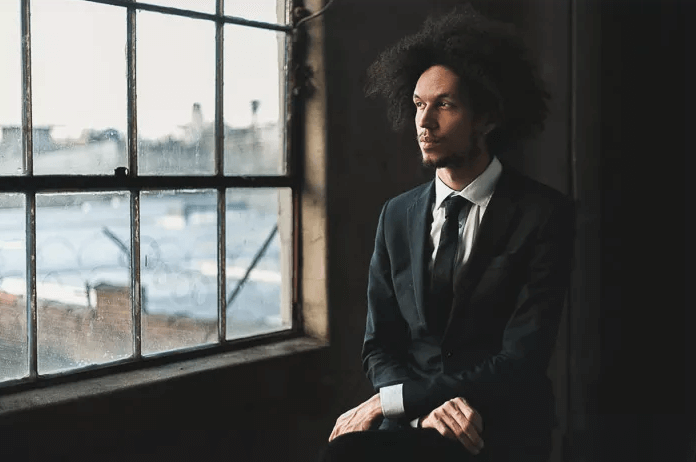
I don’t know the name of the photographer that took this photo, but they sure did do a good job. With the leading lines on the window and the subject being off-center it makes this photo all that more impactful. With the light only shining on half of the person’s body it makes it seem like there is a darker side to this character. Then the camera being angled to cut off some of the window ,making it uneven, gives more of a natural feel to this portrait. The subject’s head is perfectly lined up with the middle part of the window making it feel almost cinematic.
Then there’s the actual camera settings. This photographer chose to have a smaller aperture that way the background isn’t totally blurred out and we have more context as to where the subject is and where they’re looking out to. This helps with the total story telling of this image. They also used the lowest ISO as possible in order to keep the integrity of this portrait, making it look a lot more crisp. Based upon the low light and the picture not being blurry, I’m guessing the photographer used a tripod to capture this.
All in all this portrait is a great example of composition and problem solving. This will definitely inspire my work and it has made me think about how I can make my work even better.