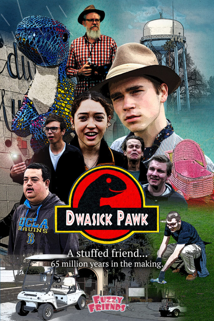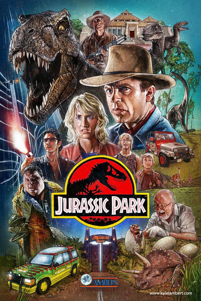
This is the page I designed as an advertisement for a little stuff dinosaur (pictured in the top-left). It was based on this Jurassic Park poster we saw:

The first challenge came from how to remove the background from the photos with people without a green screen: I learned to use and edit subject selections. The second challenge was recreating the texture gradient sky from the original image. I ended up using the clone stamp tool to create pattern templates that I brushed on at low opacity to get that gradient effect.
Overall, I learned that design can be challenging, but any challenge can be overcome with a clever approach.